We have teamed up with Australian designer, Aidan Howes, to be the creative genius behind the retro-inspired artwork features on our collection of rad tees.
The Designer
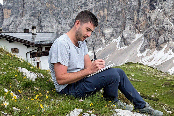
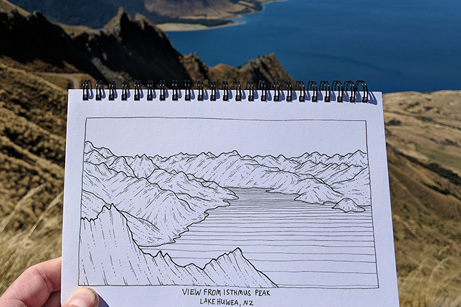
Aidan Howes is a Sydney-based illustrator who works in fine-tip and digital formats to capture his love for all things natural and related to the outdoors.
Time spent in the mountains is responsible for Aidan's inspiration alongside his passion for sport-climbing and hiking. The freedom and adventure of the natural world is the driving force behind his designs.
Aidan's bright, dreamy colour palette is chosen to capture the feeling of being out of the city and in your element, experiencing everything mother nature has to offer.
The Project
For 50 years, we have made real good Kiwi gear. The Heritage collection is inspired by classic styles from the early days. The iconic pieces each have wicked stories and adventures behind them; the essence of these tales are carried on through each collection. For our 50th Anniversary, we wanted to create a range within the Heritage Collection of special edition tees that give a nod to our rich history while giving back to the community. For every one sold, we'll donate $1 to the Macpac Fund for Good.
So with that in mind, we wanted designs that are inspired by classic Macpac scenes from the '70s, '80s, and '90s but reimagined with modern twists.
The Design
Written by Aidan Howes
I've always loved combining the outdoors and design, so being brought onboard by Macpac to help design a 50th anniversary tshirt range was a bit of dream brief. We approached the task via five designs, each intended to capture a different decade of Macpac's journey as an outfitter and brand. To do this, I poured through reams of vintage Macpac catalogues and marketing materials, to appreciate the different styles, colours and themes in each era. Think retro colours and short-shorts early on, transitioning gradually into the technical, alpine-focused brand they are now. This translated into a series of concept sketches, and then eventually five screen-printable final designs.
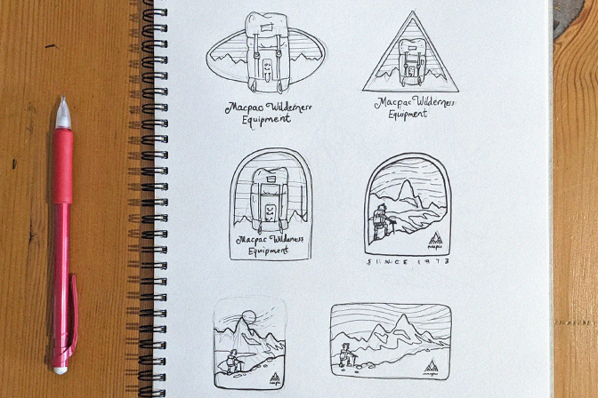
70's: I loved the opportunity to pay homage to the bright colours, retro logos and short shorts that exemplify 70s design. This one was inspired by Macpac's expedition photoshoots throughout Patagonia around the Fitz Roy peaks. Having spent some time hiking here in 2015, it was enjoyable to put together.
80's: Macpac's brand started with its big, burly canvas hiking packs - a fixture of countless Aussie and Kiwi hikers during the 80s. So, it felt only appropriate to begin my design series here, incorporating in the elegant lettering and tones present throughout Macpac's early journey as a brand.
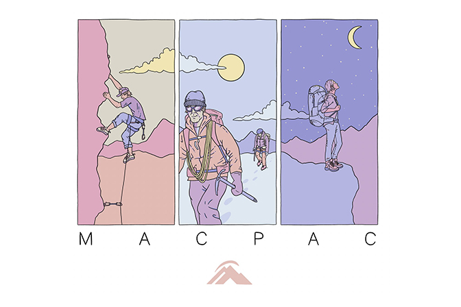
00's: This design fast-forwards a few years, celebrating the increasingly diverse range of adventure pastimes Macpac engages with as a brand. Three different sports are featured in three contrasting panels, with a flowing mountain range continuing through all three and tying them together.

